How to Make Eco-Friendly Packaging Look Luxurious and High-End
Green, or you can have it Glam. But you couldn't have both. Should a brand desire to be environmentally friendly, they were supposed to use wrought plain, brown cardboard, maybe with one-colored stamping that was slightly worn. It meant we are earth-conscious (but in many respects, to our detriment, premium). Luxury, on the other hand, implied shiny laminations and plastic windows as well as non-recyclable metallic foils and stiff boxes that were stuffed with Styrofoam.
Fortunately, that era is over. This definition of luxury changed as we proceeded into 2026. The modern customer, in particular, Millennials and Gen Z, do not simply make luxury more elegant by the shininess of the box. They define it by intent. The classic-premium brand of today delivers superior quality without compromising its values.
In Polo Packaging, there is a colossal inquiry on the brands posing the same query: How do I reduce the environmental impact, yet at the same time make my product not appear cheap?
The positive aspect is that eco-friendly packaging can, in fact, appear more advanced than the non-environmentally friendly ones. This is the way you can take it to the next level and go soft on the basic brown Kraft and make it an unboxing experience that is earth-aware instead of being something undoubtedly high-end.
1. The Power of "Eco-Minimalism"
Restraint is one of the aspects of modern luxury. Cheap brands are much noisier; they chorus loudly and loudly with overloaded graphics and heavy colors. Luxury brands whisper.
This is in line with sustainability. Eco-Minimalism is a design philosophy where one uses less ink, less area, which also makes the box easier to recycle in terms of recycling (and fewer chemicals were used). However, aesthetically, it appears purer and more costly.
Rather than pouring ink into a box, make the material the canvas. A recycled board that is in good condition with a sharp and single-color logo in the center gives a confident outlook of a professional and reused feel. It claims that our product is good to the point that we do not need all the flashy graphics to hide the fact.
2. Texture is the New Gloss
High-gloss finishes were associated with luxury in the past. However, glossy lamination is commonly a coating of cardboard by a thin layer of plastic (polypropylene) that can be hard to or even impossible to recycle.
Feeling the need to project a sense of luxury but feel guilty about using plastic, you may replace shine with texture.
Embossing and Debossing
This is among the least exploited methods of using environmentally friendly packaging. Embossing (enhance the design) or debossing (indenting the design) gives the feeling of touch. The depth when a customer had his fingers over your logo will cause a psychological connection with the quality.
The best part? It demands no ink or no plastic. It is merely altering the form of the very paper. It can be recycled entirely, and it seems to look very high-end.
Uncoated Papers
Alternatively, rather than wrapping your box in a plastic wrap, use high-grade uncoated papers that are of high GSM (grams per square meter). The heavy textured paper material feels organic and raw to the touch without seeming recycled in intent and price.
3. Soy-Based Inks: Vibrant and Non-Toxic
One of the myths is that green inks are gray or faded. That could have been the case twenty years ago, but technology has caught on.
Conventional inks used in petroleum are volatile and emit Volatile Organic Compounds (VOC) when they dry, a fact that is not good for the environment. The better ones would be soy-based or vegetable-based inks, both widely used at Polo Packaging.
Surprisingly, oil is believed to be clearer than that of petroleum. This implies that the pigment is seen through with a higher brightness, thus creating brighter and more vivid colours. You can get that "Tiffany Blue" or Hermes Orange color and still have the capacity to tell your customers that your packaging is biodegradable.
4. Smart Structural Design Over Material Excess
Luxury has always been associated with heaviness: extra layers, huge boxes with small products, and heavy fillers. And nowadays, that simply looks like waste.
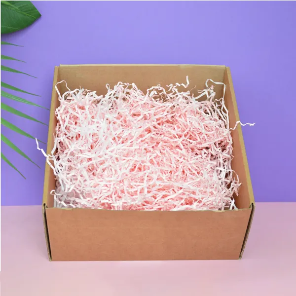
Contemporary luxury deals with engineering. A cheap foam block is nothing compared to a custom insert that has been folded out of a single sheet of corrugated cardboard to hold a perfume bottle in place perfectly.
Structural design is brought to the fore here. You can replace the use of bubble wrap, packing peanuts, or plastic blisters with a custom-sized insert, with which you will lock your product, hence holding it in place. The outcome is a neat, well-arranged presentation. Once the customer opens the box, he is presented with a jewel of a product, and that too in the hands of the paper. It appears architectural, intelligent, and costly.
5. Turning the Material into the Message
There is no need to be secretive about the fact that your packaging is recycled-own it.
Integrating the sustainability credentials into the design would be one of the most brilliant decisions you. Nevertheless, it doesn't matter how it is done. And don't merely stick a universal recycling image on the bottom.
Make it a part of the story by using typography. An elegant sentence on the inside flap that is small in size and reads, This box was made of 100% post-consumer waste, and is fully recyclable, is an added value. It tells the customer that he or she made a moral decision in purchasing with you. It validates their purchase.
To the appearance of luxury, make this text small and sans-serif. Give the eco-credentials the design respect it warrants, just like the logo.
6. Foil Stamping
Is it possible to apply metallic gold or silver foil to an eco-packaging? Yes, but with caution. Hot foil stamping applies a highly fine foil to the box. Although the foil is not paper per se, the layer is so fine that the majority of the present-day recycling plants can work with the box and extract the foil when pulping the box.
To remain really eco-friendly, however, make foil an accent, but not a background. Such a logo has been made with a small piece of gold foil on a matte black cover (soy printed ink) and is impeccable. It gives a touch of luxury in contrast without making the whole box not recyclable.
Conclusion:
It is not the material but the design which is usually the difference between a cheap recycled box and a luxury environmentally friendly package.With an emphasis on texture, structural engineering, bright vegetable inks, and understated design, you can end up with a package that will fit comfortably on the high end retail shelf with a light impact on the planet.
This is our balance at Polo Packaging. We understand what stock of paper we are dealing with when it is premium to touch, and we know how to print it in a sustainable way. In case you are willing to take your brand to the next level without reducing your values, we should build something beautiful together.