The Psychology of Color in Packaging: How to Choose the Perfect Palette for Your Brand
Just consider that you are strolling along a grocery aisle or browsing an online store. You read hundreds of pieces of merchandise within a few seconds. Suddenly, you stop. You click on one. Why?
You did not even read the ingredients yet. You didn't check the price. You did not even read the brand name.
You stopped because of the color.-
The human brain is known to process a visual piece of information 60 000 times faster than text. By the time a customer can think rationally about your product, before they can use their minds to think rationally, their subconscious mind has already formed an opinion, which they have based solely on the colors that have been used. In reality, research indicates that when forming snap judgments on products, a person may be basing the judgments on the color as much as 90 percent.
Not only do we print boxes, but we also assist brands in communicating at Polo Packaging. And the most vocal language that you have is color.
Having the appropriate color palette is not about what is pretty. It is a business move that has a bearing on the feelings of the people, their level of trust in you, and even the price they would pay.
It takes time to reach the depth of psychology of color and get ready to hack the purchases of your customers.
The Subconscious Meaning of Colors
Each of the colors evokes a certain emotional reaction. Cultural setting is one of the factors, but there are universal psychological stimuli that can be directed against adversaries by the successful brands. The secret to your packaging design is here:
1. Blue: The Color of Trust and Logic
- Emotions: Reliability, calmness, smartness, security.
- Who uses it: Tech companies (IBM, Intel), Banks (Chase, PayPal), and Medical brands.
- When to use it: It should be used when your selected product necessitates a high level of trust, such as in the case of supplements, electronics, or skincare. Dark navy blue shouts out professional and established, whereas light sky blue is calming and hygienic.
2. Red: The Color of Urgency and Appetite
- Emotions: Excitement, passion, danger, hunger.
- Who uses it: Fast foods (McDonald's, KFC), Clearance shopping (Target), Bold lifestyle brands (Supreme, Coca-Cola).
- When to use it: Red actually increases the speed of the heart. It creates a sense of urgency. When you would have your packaging to stare out of a shelf and tell you "Now, look at me!- then, use red. But be careful with it--the excessive use of red may be aggressive or vulgar, according to the color.
3. Green: The Dual-Meaning Powerhouse
- Emotions: Nature, health, sustainability and Wealth.
- Who uses it: Whole Foods, Land Rover, Finance applications.
- When to use it: Organic items, eco-friendly products, or vegan items are the obvious ones to use. A nudged up, still olive green on a Kraft box is the final indicator of nature. Nevertheless, a rich dark emerald green tends to be linked with old money and affluence and is unlikely to compete with high-end products.
4. Black: The Velvet Rope
- Emotions: Resonate to luxury, exclusivity, mystery and sophistication.
- Who uses it: Chanel, Apple (pro lines), high-end liquor.
- When to use it: No, black is not just a color; it is a statement. A black box informs the customer: This is an expensive product, and it is worth it. It gives it an impression of heaviness and solemnity. When selling a high-end item, the gold standard of a high-end package is a matte black box that has a foil stamp.
5. White: The "Apple" Effect
- Emotions:Innocence, cleanliness, simplicity, sparsity.
- Who uses it: Apple, Minimalist skincare, Glossier.
- When to use it: White space can be attributed to an environment of modern design. It implies that there is nothing to conceal. The pure white box would be disruptive in a market full of loud colors, the most. It alerts that it is a clean, efficient, and modern product.
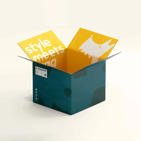
6. Yellow & Orange: The Optimists
- Emotions: Friendliness, happiness, affordability, creativity, emotions.
- Who uses it: Amazon (arrow), Nickelodeon, and low-cost carriers.
- When to use it: It is used when you are high energy. They are hospitable and amiable. These are excellent options on the item, in case you have gathered fun and approachable as a brand voice, not serious and expensive. Yellow, however, is the most difficult color a human eye can read, and thus, you should not use white text on a yellow background.
"60-30-10" Rule for Packaging
So what do you do with the colors now that you know what they depict? You don't want a rainbow mess.
Something designers make to achieve a harmonious palette is the 60-30-10 Rule:
- 60% is your Primary Color: This is the background color of your box (e.g. White mailer, or Kraft brown background). It sets the tone.
- 30% is your Secondary Color: This endorses the primary one (e.g., massive Blue logo or pattern). It creates interest.
- 10% is your Accent Color: This is applied to the Call to Action or little elements (e.g., a bright Orange URL on the site or a social media icon). It attracts attention to the most significant information.
A Critical Technical Note: Screen vs. Print (RGB vs. CMYK)
This is where many business owners get heartbroken. You pick a stunning, neon electric blue on your computer screen. You send the file to print. When the boxes arrive, the blue looks muddy and dull.
Why?
- Screens: RGB (Red, Green, Blue): They make color light. They can produce neon colors in millions of super-brights.
Printers: Work with CMYK (Cyan, Magenta, Yellow, Key/Black): the printers use ink to generate color. Writing on paper can never be believed to be as bright as a bulb on a screen.
Resolution: This is always solved by specifying your packaging files in CMYK mode. When you have a very extreme brand color (such as Coca-Cola Red) that you insist that it must be flawless, inquire about Pantone (PMS) Printing. This is achieved by combining a particular ink before loading it into the machine, which ensures that the color matches 100 percent, even though it is a little more expensive than normal digital printing.
Context is Everything
Last, but definitely not least, bear in mind the fact that the psychology of color does not exist in vacuums. It depends on your industry.
- The Black box may be frightening or may seem to be deadly, even though traditionally, black is a sign of luxury in case you sell Organic Baby Food. Soft pastels or white would be more suitable.
- In the case of Extreme Energy Drinks, people will believe that it is a hypnotic product in a Soft Lavender box. You need Neon Green or Black.
Look at your competitors. When everyone in your industry is using Blue, then doing Orange is a risky yet, perhaps, huge opportunity to get different (this is what is sometimes referred to as the Purple Cow theory).
Conclusion:
Color can be an effective weapon, and it can be rather difficult to use it on cardboard, corrugated material, or rigid board. The absorbance and the look of the color to the human eye are influenced by the texture of the material.
We do not simply press a few buttons at Polo Packaging. As your brand guardians, we act. We will be able to assist you in selecting the appropriate color codes, recommend which to use, CMYK or Pantone, and make sure that the same feeling that you wished your customer to experience when that box arrives at his/her doorstep is what the customer will feel